
Power Apps Project Profitability App: control and gain more
Every good solution begins with a problem. For our part, our problem was a simple one: project costs were paid out through various tools such that one couldn’t immediately determine whether or not a project made a profit. Teams were wasting hours struggling to pull together information from spreadsheets, invoices, and email that could’ve been spent doing work.
That’s where the idea to develop a Power Apps project profitability app evolved. Instead of having to accommodate a number of standalone systems, we developed an app tailored to our needs with a capability to bring all that data into one place. A real app for a real problem.
With Power Apps, Microsoft’s platform for building business applications without the need for coding and easily connecting to tools like Dataverse, SharePoint, or Excel, we designed an application that organizes all key project data into clear and functional blocks:
- Administration: registering clients, employees, projects, contractors, and suppliers.
- Expenses: recording purchases, payroll, contractor contracts, and other costs such as transportation, meals, or logistics.
- Payments: managing invoices issued to clients for different projects. Results: the core of the application, where indicators and balances reveal whether a project is truly profitable.
Thusly, the app centralizes information but also allows for a transparent, practical insight into profitability for every project.
In order to make Power Apps project profitability app user-friendly, we created it with a simple but effective design that takes the user through step by step.
Main Structure Of The Project Profitability Application Of Power Apps
Img.1
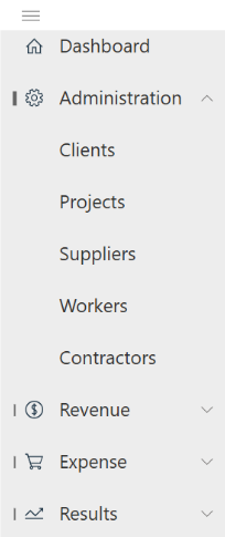
Sidebar navigation
On the left side, a sidebar provides quick access through recognizable icons:
- Home/Dashboard (house icon)
- Administration (gear ⚙️)
- Payments (dollar sign $)
- Expenses (shopping cart 🛒)
- Results (chart 📈)
Each icon leads directly to its functional block, ensuring a clear and organized navigation.
Header
At the top, the header displays the app’s name: Project Control. Just below, the active section is highlighted—for example, Dashboard—so users always know where they are.
Main content area
This is the central space of the app, where forms, reports, and indicators appear depending on the section selected from the sidebar. It’s the workspace where users interact with the core features of the app.
Sidebar Navigation
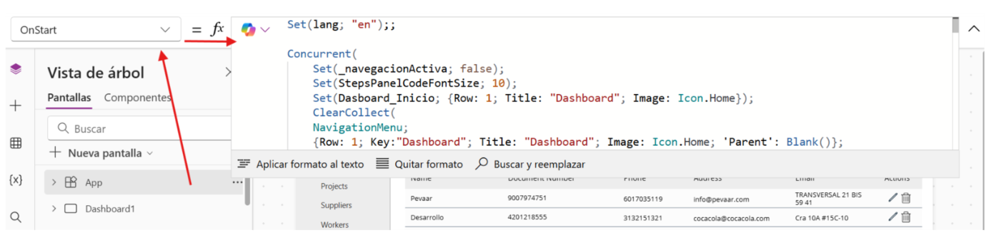
To bring the sidebar to life in our Power Apps project profitability app, we started from the Tree view inside the Power Apps editor. By selecting the app and configuring the OnStart property, we set up the initial state and navigation menu that would guide the user through the application.
Img.2
Next, write the following configuration in the bar:
Concurrent(

    // Initial states

    Set(_activeNavigation; false);

    Set(StepsPanelCodeFontSize; 10);

// Base record for the dashboard (correct the variable name if you use in other places)

    Set(Dashboard_Inicio; { Row: 1; Key: "Dashboard"; Title: "Dashboard"; Image: Icon.Home });

// NavigationMenu (parent/child) for the sidebar

    ClearCollect(

        NavigationMenu;

// Level 0

        { Row: 1;  Key: "Dashboard";        Title: "Dashboard";                         Image: Icon.Home;         'Parent': Blank() };


     { Row: 2;  Key: "Administration";    Title: MicrosoftTranslatorV2.Translate(lang; "Administration"); Image: Icon.Settings;     'Parent': Blank() };

        { Row: 8;  Key: "Income";          Title: MicrosoftTranslatorV2.Translate(lang; "Income");       Image: Icon.Money;       'Parent': Blank() };

        { Row: 10; Key: "Expenses";            Title: MicrosoftTranslatorV2.Translate(lang; "Expenses");         Image: Icon.ShoppingCart; 'Parent': Blank() };

        { Row: 16; Key: "Results";        Title: MicrosoftTranslatorV2.Translate(lang; "Results");     Image: Icon.Trending;    'Parent': Blank() };

 // Administration (children)

        { Row: 3;  Key: "Clients";          Title: MicrosoftTranslatorV2.Translate(lang; "Clients");       Image: Icon.People;      'Parent': "Administration" };

        { Row: 4;  Key: "Projects";         Title: MicrosoftTranslatorV2.Translate(lang; "Projects");      Image: Icon.Briefcase;   'Parent': "Administration" };

        { Row: 5;  Key: "Suppliers";       Title: MicrosoftTranslatorV2.Translate(lang; "Suppliers");    Image: Icon.Building;    'Parent': "Administration" };

        { Row: 6;  Key: "Workers";      Title: MicrosoftTranslatorV2.Translate(lang; "Workers");   Image: Icon.Person;      'Parent': "Administration" };

        { Row: 7;  Key: "Contractors";      Title: MicrosoftTranslatorV2.Translate(lang; "Contrators");   Image: Icon.Toolbox;     'Parent': "Administration" };


  // Income (children)

        { Row: 9;  Key: "Payments Received";   Title: MicrosoftTranslatorV2.Translate(lang; "Payments Received"); Image: Icon.Check;       'Parent': "Income" };


        // Expenses (children)

   { Row: 11; Key: "Purchases;           Title: MicrosoftTranslatorV2.Translate(lang; "Purchases");         Image: Icon.ShoppingCart; 'Parent': "Expenses" };

        { Row: 12; Key: "Direct labor";   Title: MicrosoftTranslatorV2.Translate(lang; "Direct labor");   Image: Icon.Clock;        'Parent': "Expenses" };

        { Row: 13; Key: "Indirect labor"; Title: MicrosoftTranslatorV2.Translate(lang; "Indirect labor"); Image: Icon.People;       'Parent': "Expenses" };

        { Row: 14; Key: "Other";             Title: MicrosoftTranslatorV2.Translate(lang; "Other");           Image: Icon.More;        'Parent': "Expenses" };

        { Row: 15; Key: "Other Costs";      Title: MicrosoftTranslatorV2.Translate(lang; "Other Costs");    Image: Icon.CostEstimates; 'Parent': "Expenses" };


        // Results (children)

        { Row: 17; Key: "Indicators";       Title: MicrosoftTranslatorV2.Translate(lang; "Indicators");     Image: Icon.Chart;       'Parent': "Results" };

        { Row: 18; Key: "Profits";        Title: MicrosoftTranslatorV2.Translate(lang; "Profits");      Image: Icon.Calculator;  'Parent': "Results" }

    );

    // State of the submenu

    Set(_activeSubmenu; Blank())

);
Behind The Setup
To make sure the Power Apps project profitability app runs smoothly from the very beginning, we used a few key elements in the initialization:
- Concurrent( … ): Runs several actions at the same time, so the app starts up faster instead of loading things one by one.
- Set( … ): Creates or updates global variables that the app uses to remember states or values while you navigate.
- _navegacionActiva and _submenuActive: control which part of the menu is active at any given time.
- StepsPanelCodeFontSize: defines the base font size for help panels or guides.
- Dashboard_Start: stores the default data for the main dashboard so it’s ready when the app opens.
Building The Sidebar Menu
The sidebar of the Power Apps project profitability app is powered by a collection created with ClearCollect(NavigationMenu; …). This collection is like the database of the menu, where each record defines how an item should look and behave:
- Row: decides the visible order of items in the menu.
- Key: works as a unique identifier so navigation always knows which screen to open.
- Title: the text label shown to the user. It can even be translated automatically with MicrosoftTranslatorV2.Translate(lang, “Text”) for multilingual apps.
- Image: the icon that visually represents the item, making navigation quicker and more intuitive.
- Parent: sets the hierarchy. If it’s blank, the item is a main section (like Administration). If it points to another key, it becomes a child item (like Clients under Administration).
- Translation: lang must be defined beforehand (for example, ‘is’/’in’). If you use multiple languages, this pattern keeps the bilingual menu.
Navigation Gallery Setup In Power Apps
To make the sidebar dynamic in the Power Apps project profitability app, we used a vertical gallery that automatically builds the menu based on the collection. Here’s how it works:
- Main gallery (roots): shows only the top-level items.
Formula: SortByColumns(Filter(NavigationMenu, IsBlank('Parent')), "Row", Ascending).
- Submenu: displays child items related to the section currently selected in the main gallery.
Formula: SortByColumns(Filter(NavigationMenu, 'Parent' = galMenuPrincipal.Selected.Key), "Row", Ascending).
- Click navigation: when the user clicks on an item, the app either updates the active submenu or navigates directly to the screen connected to that item.
Formula: Set(_submenuActivo, ThisItem.Key) or Navigate(ScreenFromKey(ThisItem.Key)).
On the main screen of the application, a blank vertical gallery is inserted that will serve as a dynamic navigation menu. The following formula is assigned to the OnSelect property of the gallery item:
If(

    CountRows(Filter(NavigationMenu; 'Parent' = ThisItem.Key)) > 0;


//If the item has submenus, activate or desactivate the submenu

Set ( _Activesubmenu; If(_Activesubmenu = ThisItem.Key; Blank(); ThisItem.Key));


    // If there are no submenus, set the item as selected and navigate to the corresponding screen

    Set(_Dashboard_Start; ThisItem);

    Switch(

        ThisItem.Key;

        "Dashboard"; Navigate(Dashboard1; ScreenTransition.None);

        "Clients"; Navigate(Clients; ScreenTransition.None);

        "Workers"; Navigate(Workers;

 ScreenTransition.None);

        "Suppliers"; Navigate(Suppliers1;

ScreenTransition.None);

        "Contractors"; Navigate(Contractors1; ScreenTransition.None);

        "Projects"; Navigate(Projects1; ScreenTransition.None);

        "Purchases"; Navigate(Purchases1; ScreenTransition.Fade);

        "Direct Work"; Navigate(DirectWork1; ScreenTransition.Fade);

        "Indirect Work"; Navigate(IndirectWork1; ScreenTransition.Fade);

        "Others"; Navigate(Others1; ScreenTransition.Fade);

        "Payments Received"; Navigate(Payments1_1; ScreenTransition.Fade);

        "Indicators"; Navigate(Indicators1;  ScreenTransition.Fade);

        "Other Costs"; Navigate(OthersCosts1; ScreenTransition.Fade);

        "Profits"; Navigate(Profits1; ScreenTransition.Fade)

    )

)
Submenu validation
-
CountRows(Filter(NavigationMenu; 'Parent' = ThisItem.Key)) > 0 - Check if the selected item has child records in the NavigationMenu collection.If it has children, the menu behaves as expandable/collapsible and does not perform immediate navigation.
Management of active submenu
-
Set(_submenuActivo; If(_activeSubmenu = ThisItem.Key; Blank(); ThisItem.Key)) - Define whether the submenu of the item is shown or hidden.
Assignment of the active item
-
Set(_Dashboard_Home; ThisItem) - The menu that the user chose is stored in a global variable, so the app knows which one to highlight and can show the navigation path (breadcrumb).
Navigation to screens
- Switch(ThisItem.Key; …) is used to evaluate the key value of the item (Key).
- Depending on the value, Navigate(Screen; Transition) is executed, which takes the user to the corresponding screen with a transition effect.
Then, inside the following controls are inserted:
Label with the property Text = ThisItem.Title (The title of the menu blocks as well as the subtitles)
Icon with the property Icon = ThisItem.Image (Image of the corresponding icon already defined in OnStar)
Icon with the property Icon = Icon.ChevronDown (Scroll arrow)
Finally, a hamburger menu icon is inserted with the property OnSelect = Set(IsExpand; !IsExpand) (Logic to expand the side menu)
Img.3
App Header Configuration:
A Rectangle is inserted, a label for the app’s title, and a support Icon.

Img.4
Screens
Next, we will begin the creation of the screens for our Power Apps project profitability app.
Module 1
Dashboard
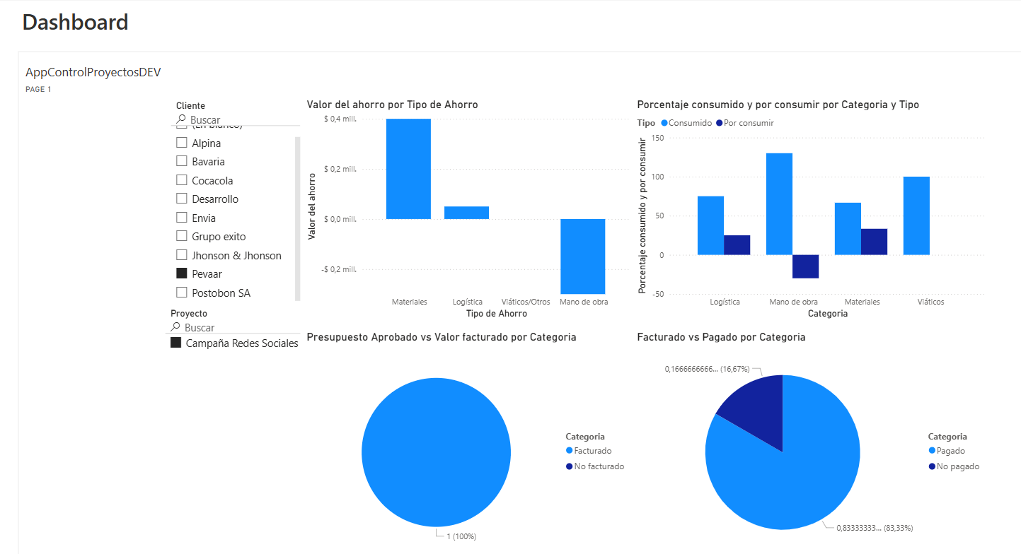
The Dashboard is the heart of the Power Apps project profitability app. Here, users get a quick snapshot of ongoing projects, key figures, and essential alerts. It’s the first stop for decision-making, giving managers clarity at a glance — a real app for a real problem.
To begin with, insert a blank vertical container, and within it the following controls:
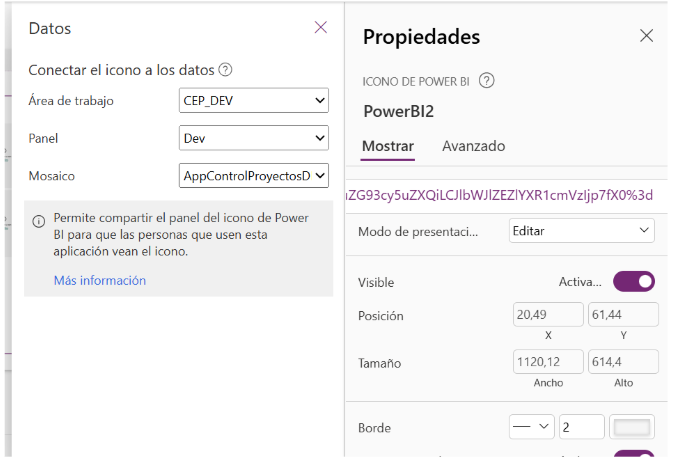
Label with the title “Dashboard” in its Text property Power BI icon control:
In the properties tab, we select the Power BI workspace where the report is, then the panel, and finally the tile.
Img.5
Img.6
Module 2
Administration Block:
The Administration module organizes the foundation of every project. With submodules for clients, projects, suppliers, workers, and contractors, it centralizes all the important records. This ensures smooth operations and avoids the chaos of scattered information.
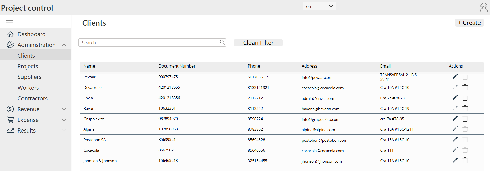
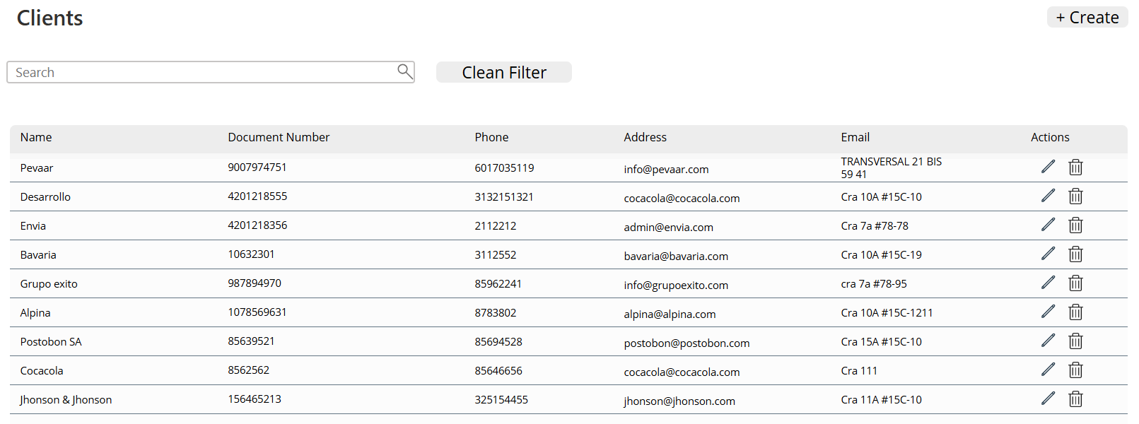
2.2.1 Clients
- A label is inserted for the title “Clients” in its Text property.
- A text box with a search icon is inserted for filtering all the columns of the table.
- A button is inserted to clear the text box (the filter).
- A blank vertical gallery is inserted with the property Items
 Sort(

     Search(ClientApp;

        TextInput_ Search _Client_4.Text;

        ClientName; DocumentNumber;Phone; Email; Address

    );

    'Created On';

    SortOrder.Descending

)
Data Source
- ClienteApp is the data source that contains the list of registered clients.
- This table includes fields such as ClienteName, DocumentNumber, Phone, Email, and Address.
Search Functions
-
Search(ClientApp; TextInput_Search_Client_4.Text; …)Allows you to perform a text search across multiple fields at once.
- TextInput_Search_Client_4.Text is the search box where the user types the term to search.
- The indicated fields (ClientName; DocumentNumber; Phone; Email; Address) are the ones filtered by that search.
Sort Function
-
Sort( … ; 'Created On'; SortOrder.Descending)Sorts the search results by the ‘Created On’ column (the date the record was created)
- SortOrder.Descending ensures that the most recent customers appear at the top of the list.
Then, inside the gallery, labels are inserted for the colums of the table in the case (Name, Document number, Phone, Address, Email) and finally in the table, 2 icons, an icon for Delete (OnSelect property : Set(varClientDeletionRecord; ThisItem);;UpdateContext({ popDelete: true })) and the other for Edit (OnSelect property: Set(ClientItemRecord; ThisItem);; Navigate(EditClients))
For the labels, the properties Text (ThisItem.ClientName, ThisItem. DocumentNumber, etc.) are used; these correspond to the names of the columns in the table in Dataverse.
On the same screen, a button named ‘Create’ is inserted with its OnSelect = Navigate( CreateClients; ScreenTransition.None) to navigate to the Create Clients screen.
Img.7
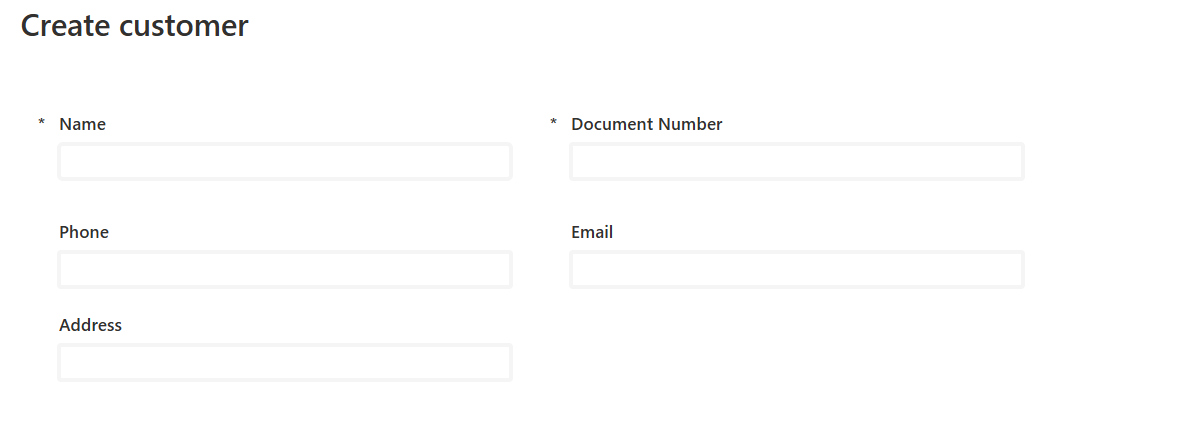
To create the “Create Client” screen, the following controls are inserted:
- Back button with its Onselect = Back()
- “Save” button with its OnSelect = SubmitForm(Form_CreateClient_1) to submit the form with the client’s data.
- Label with its Text property = “Create Client” Form with its Item property=
ClienteApp (Table name in dataverse) and the OnSuccess = Notify("Client created successfully"; NotificationType.Success);;
NewForm(Form_CreateClient _1);;

Navigate(Clients; ScreenTransition.Fade)
Img.8
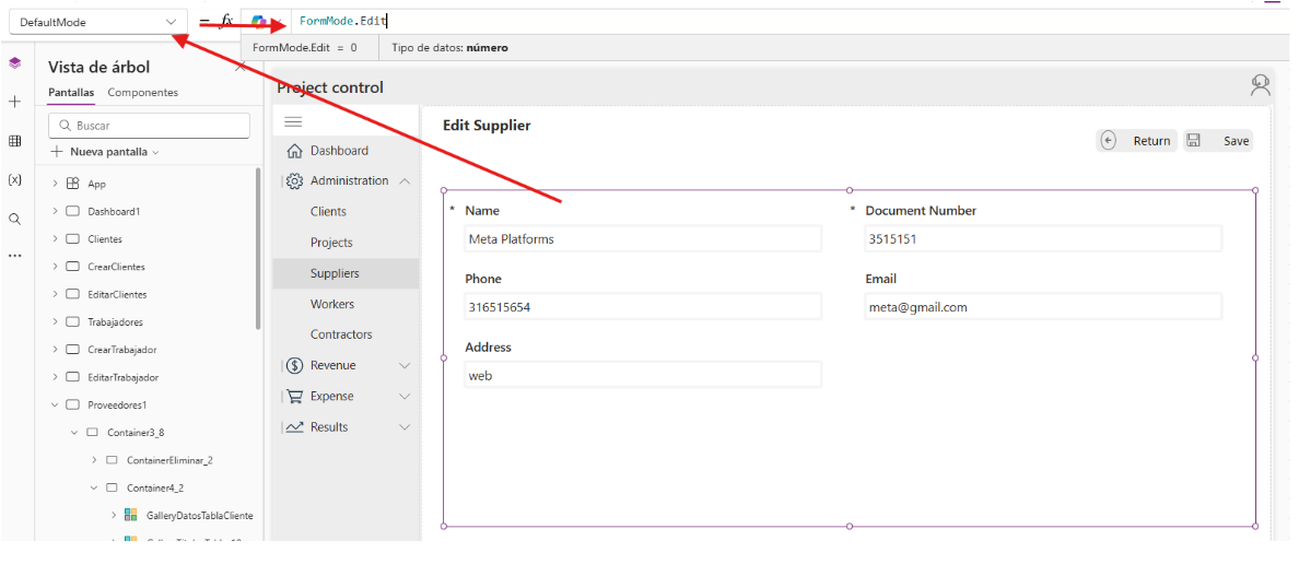
To create the Edit Client screen, it is done in the same way as the “Create Client” screen, but the form changes in its property.
DefaultMode = FormMode.Edit
Img.9
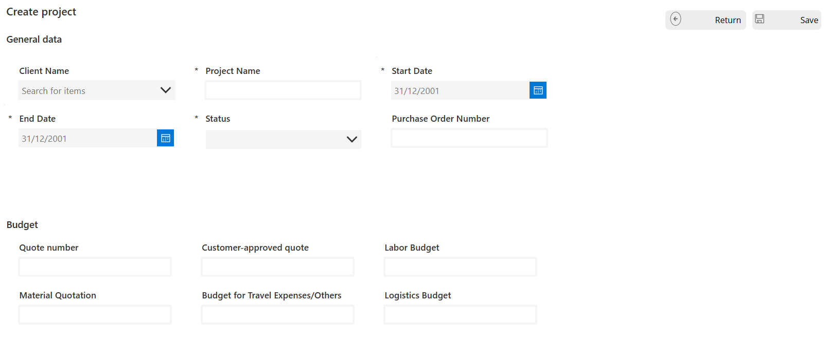
2.2.2 Projects
For the projects screen, the steps for projects and creating a project are followed just like in point (2.2.1), the difference is in the edit screen.
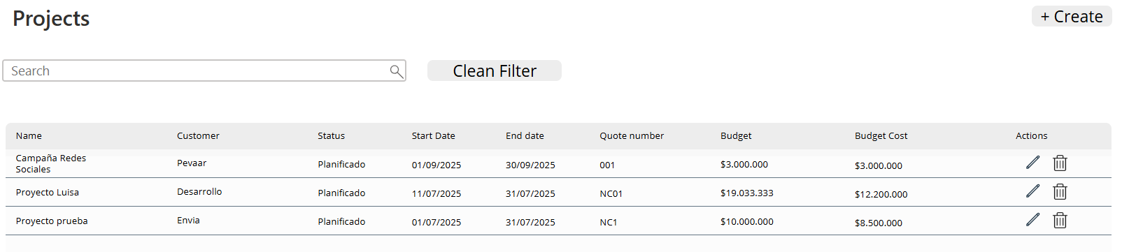
Img.10
Img.11
For the edit screen, we have a horizontal menu that contains the same structure as the left sidebar menu but filtered for the selected project:
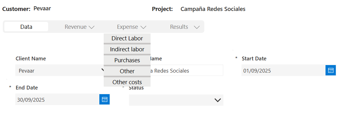
Img.12
Pressing the menu items redirects us to tables of the screens, but filtered by the selected project. For example, Direct labor (Payroll).
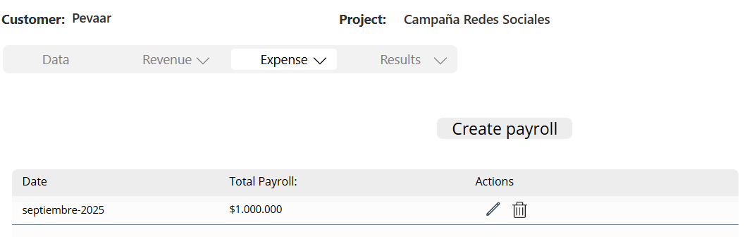
Img.13
In the results, we find 2 screens; the first one shows the project indicators, which are labels with the information filtered by project from the dataverse tables:
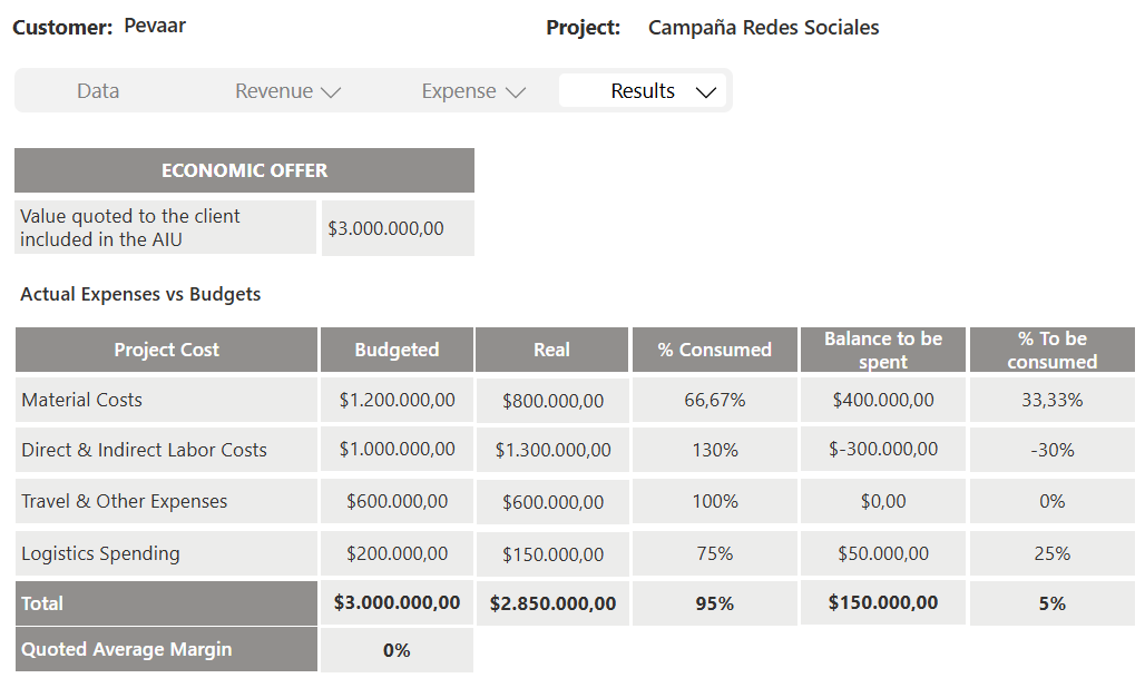
Img.14
The second is the utilities of the project:
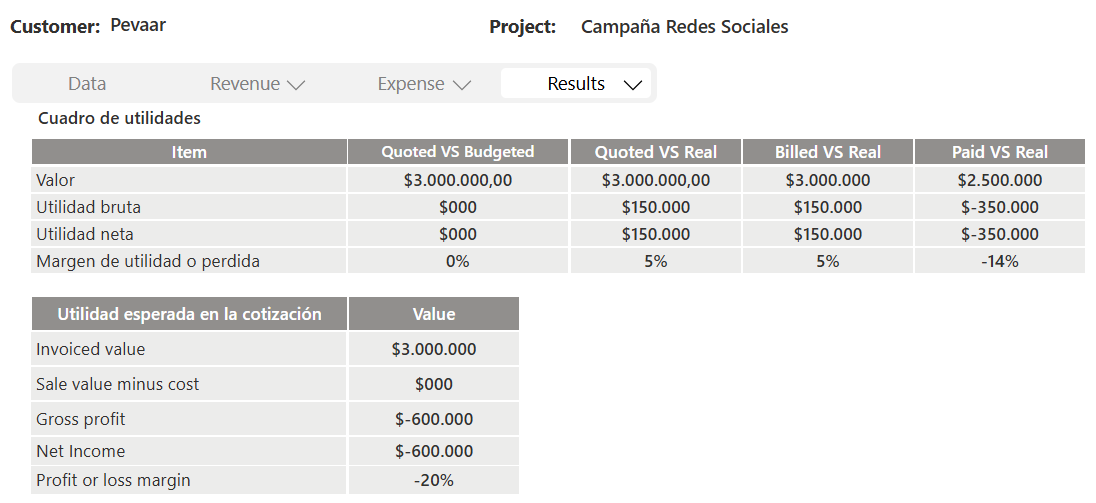
Img.15
2.2.3 Suppliers
In the same way as in point (2.2.1) supplier screens are created, create supplier and edit supplier.
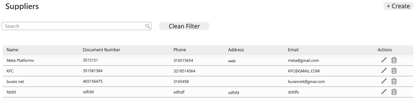
Img.16
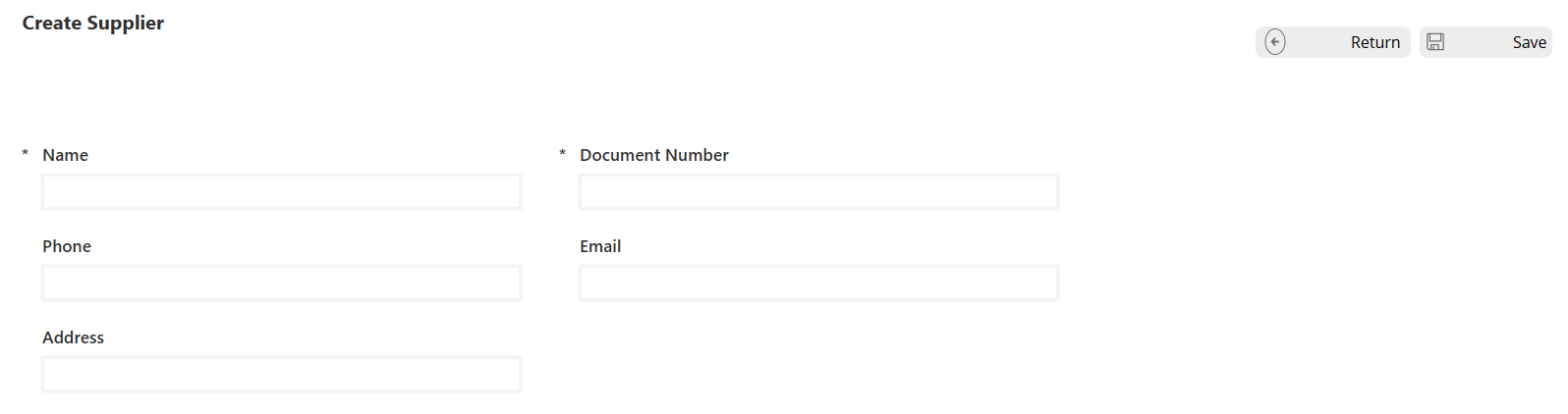
Img.17
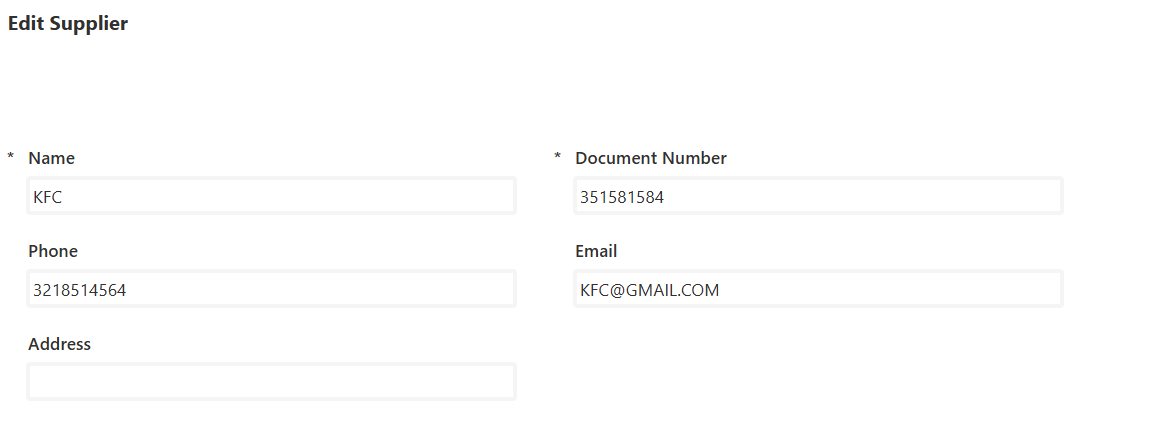
Img.18
2.2.4 Workers
In the same way as in point (2.2.1) the workers screens are created, create worker and edit worker.
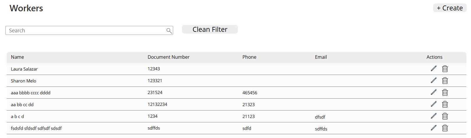
Img.19
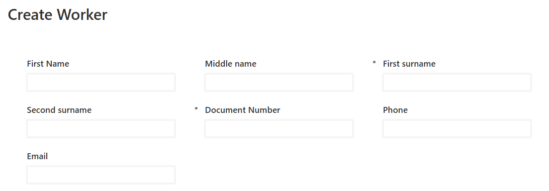
Img.20
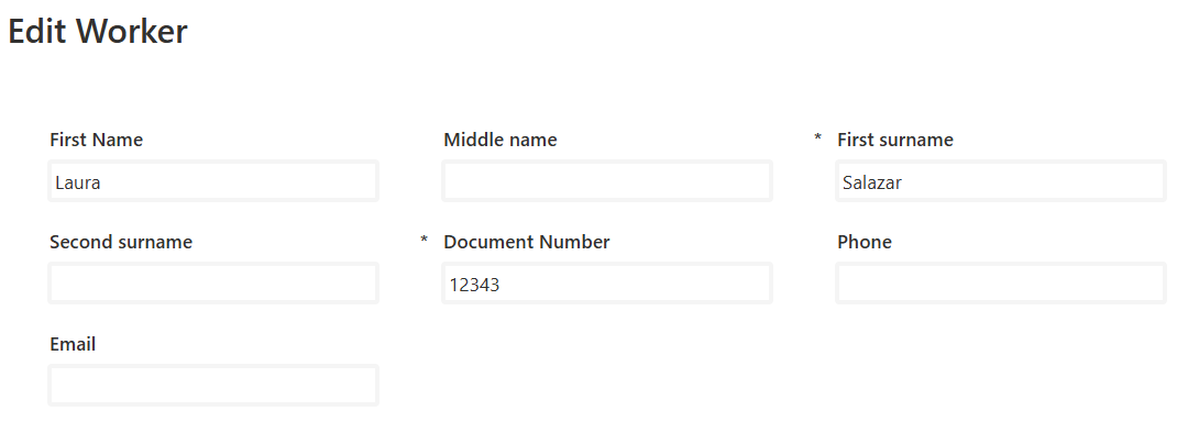
Img.21
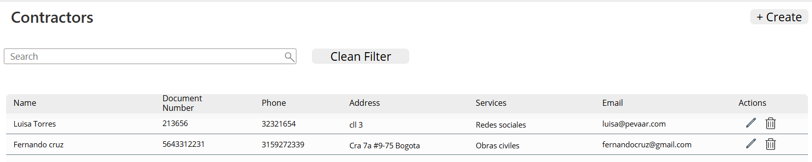
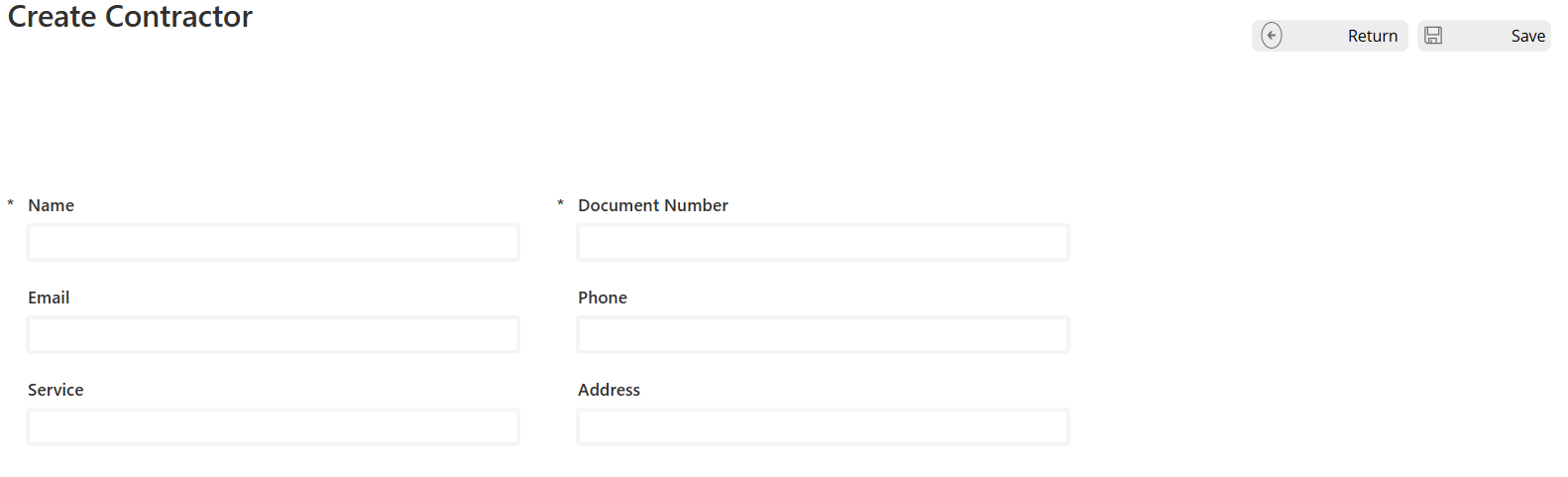
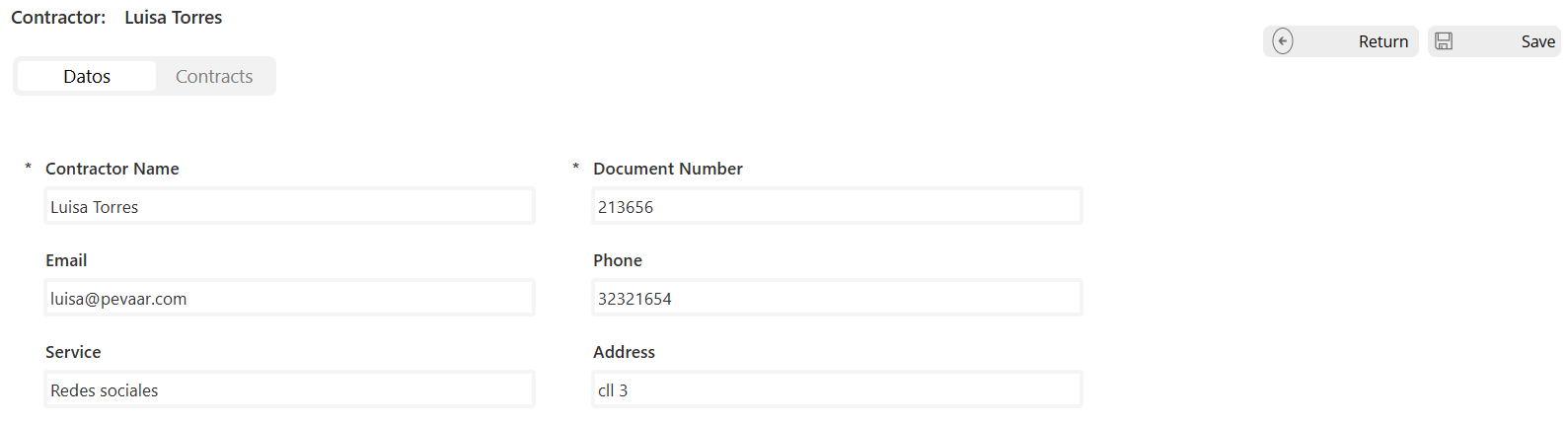
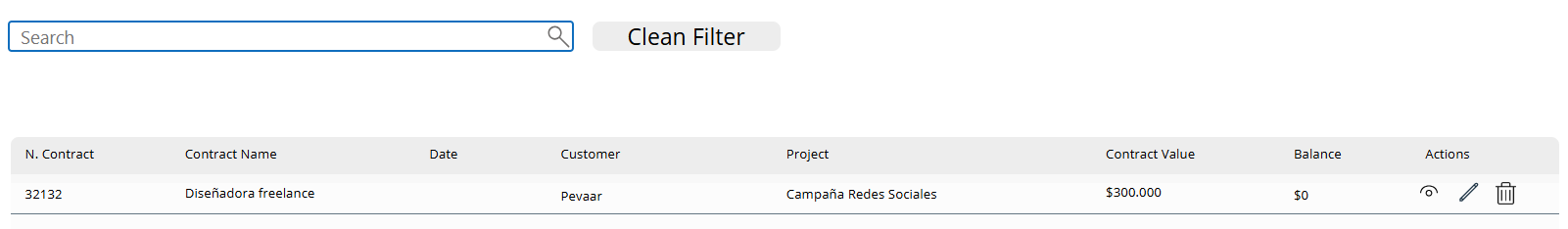
2.2.5 Contractors
In the same way as in point (2.2.1), the contractor screens are created. Create a contractor, but to edit the contractors there is a difference, which is that we add a table of Contracts, which will be the contracts of the projects associated with the selected contractor.
Img.22
Img.23
In the Data table, reuse the creation form, configured in edit mode to update existing records. In the Contracts table, a filtered table is presented that shows only the contracts linked to the currently selected contractor.
Img.24
Img.25
MODULE 3
INCOME BLOCK:
The Income module keeps track of invoices and received payments, making sure every peso is accounted for. By simplifying revenue management, it helps project leaders understand cash flow and ensure financial control.
The payment received screen is created in the same way as in point 2.2.1.
Img.26
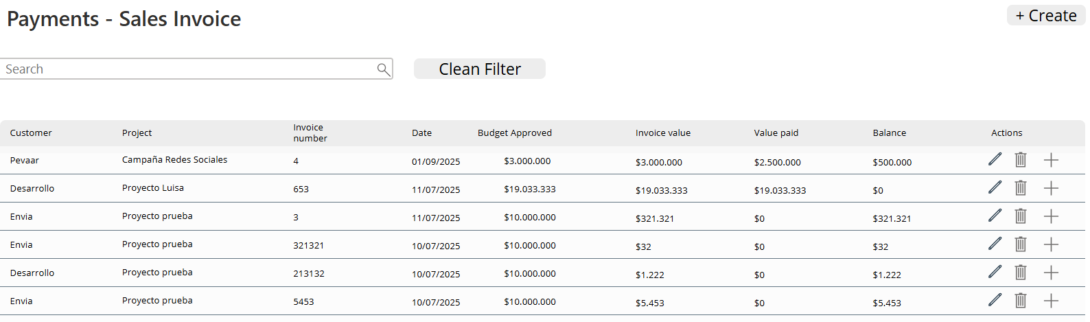
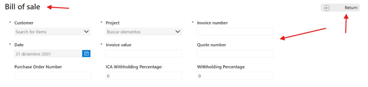
Sales invoice screen:
The back button control is the same as in point 2.2.1, as well as the title label.
A form is created and connected to the data source of the InvoicePayments table in its DataSource property with the fields of Client, Project, Invoice number, Date, Invoice value, Budgeted value, Purchase order number, ICA withholding, Withholding.
Img.27
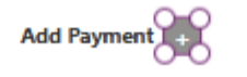
A button with the name “+” is added with
OnSelect:

Collect(TemporaryInvoicePayments;

    {

        Payment_Date: Today();

        Payment_Value: 0 ;

        Advance: "";

        TotalPayment 0

    }

)
Explanation of the formula
- Function Collect
Its purpose is to create or add records to a local collection within the application. In this case, the collection is TemporaryInvoicePayments.
- Record inserted
A record is added with the following fields and initial values:
- Payment_Date → assigned the current date using Today().
- Payment_Amount → initialized to 0, waiting for the user to enter the actual amount.
- Advance → empty field (“”), intended to store advance information if applicable.
- TotalPayment → initialized to 0, which will then be calculated based on the payment data.
And a label with the Text = “Add payment”
 Img.28
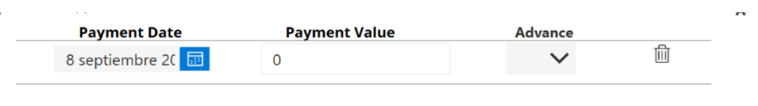
Then we insert a blank vertical gallery: In its Item property we set TemporaryPaymentsInvoice and inside we insert 4 controls:
-
Datepicker con ThisItem.Payment_Date on his property DefaultDate -
InputText with ThisItem.Payment_Value on his property Default -
Dropdown con [""; “Yes”; “No”] in Items
stationery icon with Remove(TemporaryInvoicePayments; ThisItem) in Items.
 Img.29
Four labels are inserted for the total paid and the balance.
Labels “Paid Value” we have in Text =  "$" & Text(Sum(TemporaryInvoicePayments; Value(Paid_Value));"#,##0.00")

Labels “Balance” we have in Text =  "$" & Text(Value(DataCardValue24.Text) - Sum(TemporaryPaymentsInvoice; Value(Payment_Value)); "#,##0.00")

Img.30
Finally, the save button has the logic to save the invoices in the tables by linking the payments:
If(

    CountRows(TemporaryInvoicePayments) = 0;

    Notify("You must add at least one payment"; NotificationType.Error);

    With(

        {

            newInvoicePayments: Patch(

                InvoicePayments;

                Defaults(PaymentsInvoice);

                {

                    InvoiceNumberProject: DataCardValue38.Text;

                    InvoiceDate: DateValue5.SelectedDate;

                    ClientAppRelation: DataCardValue43_2.Selected;

                    ProjectAppRelation: DataCardValue46.Selected;

                    PaidAmount: Sum(TemporaryInvoicePayments; Payment_Value);

                    ReteICA: Value(DataCardValue30.Text);

                    Retention: Value(DataCardValue31.Text);

                    ApprovedClientBudget: Value(DataCardValue28.Text);

                    QuoteNumber: DataCardValue33.Text;

                    PurchaseOrderNumber: DataCardValue35.Text;

                    InvoiceValue: Value(DataCardValue24.Text)
                }
            )
        };

        If(

            !IsBlank(newInvoicePayments);

            ForAll(

                TemporaryPaymentsInvoice;

                Patch(

                    ProjectInvoicePayments;

                    Defaults(ProjectInvoicePayments);

                    {

                        PaymentDate: Payment_Date;

                        PaymentValue: Payment_Value;

                        Advance: Advance;

                        InvoicePaymentRelation: newInvoicePayments

                    }

                )

            );;

            Clear(TemporaryInvoicePayments);


            Notify("Invoice and payments saved successfully"; NotificationType.Success)

        )

    )

);;

ResetForm(Form5);;

Navigate(Payments1_1; ScreenTransition.Fade)
Next, I will explain in more detail.
- Initial Validation
     If(CountRows(TemporaryInvoicePayments) = 0;

    Notify("You must add at least one payment";        NotificationType.Error);
- Check if the TemporaryInvoicePayments collection is empty. If there are no payments, show an error notification and stop the process.
2. Creation of the invoice
         newInvoicePayments: Patch(InvoicePayments;

    Defaults(InvoicePayments); {...})
- Use Patch to insert a new record in the InvoicePayments table.
- The data comes from form controls (DataCardValueXX) and calculations (eg. Sum(TemporaryInvoicePayments; Payment_Value)).
- The result is saved in the context variable newInvoicePayments.
3. Payment registration associated
         ForAll(TemporaryInvoicePayments;

               Patch(InvoicePaymentsProject;

        Defaults(InvoicePaymentsProject); {...})
        )
- Repeat the process for each record in the TemporaryInvoicePayments collection.
- Insert each payment into the PaymentsInvoiceProject table, linking it with the newly created invoice through InvoicePaymentsRelation: newInvoicePayments.
4. Cleaning and confirmation
       Clear(TemporaryPaymentsInvoice);
     Notify("Invoice and payments saved successfully;
     NotificationType.Success)
- Delete the temporary collection to avoid duplicates.
- Show a confirmation message.
5. Final actions
     ResetForm(Form5);;
    Navigate(Payments1_1; ScreenTransition.Fade)
- Reset the Form5 to its initial (clean) state.
- Redirect to the Payments1_1 screen with a Fade transition.
Module 4
Expenses Block
The Expenses module registers every cost: purchases, direct labor, indirect labor, and other expenses like logistics or supplies. This is where teams can see exactly how money is being spent — a key part of knowing if a project is truly profitable.
2.4.1 Purchases
It is done in the same way as in point 2.3, the difference is in the controls that are inserted in the gallery.
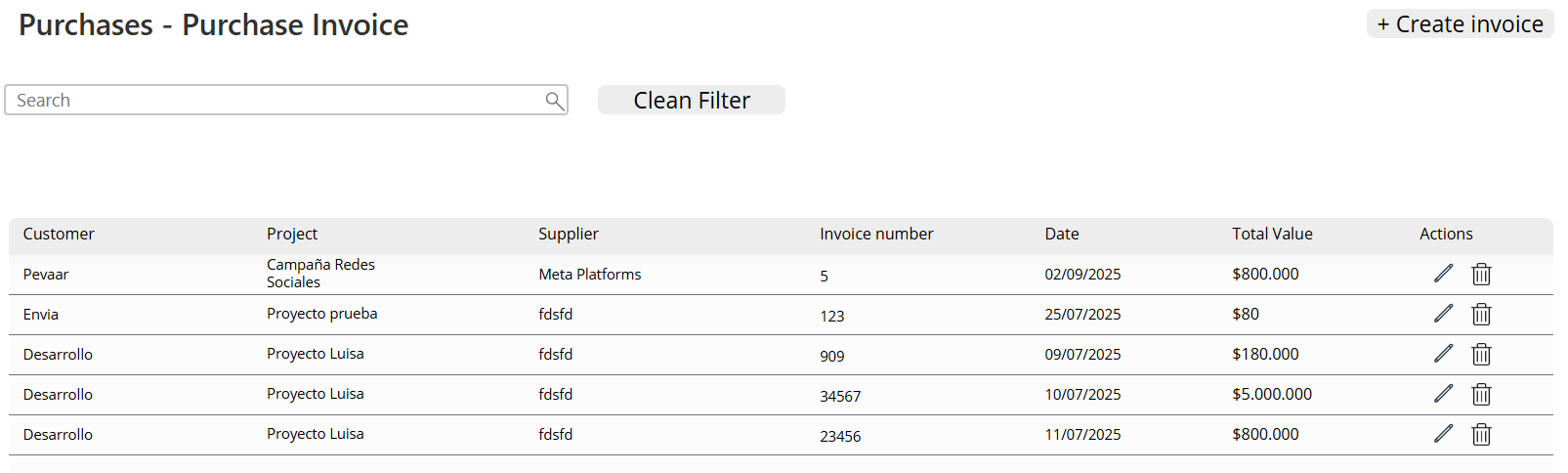
Img.31
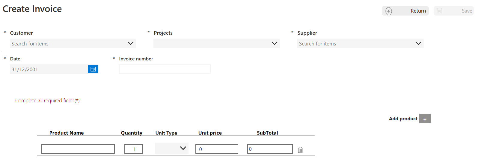
Img.32
2.4.2 Direct Payroll or direct labor:
The Direct Labor screen is created in the same way as in point 2.2.1.
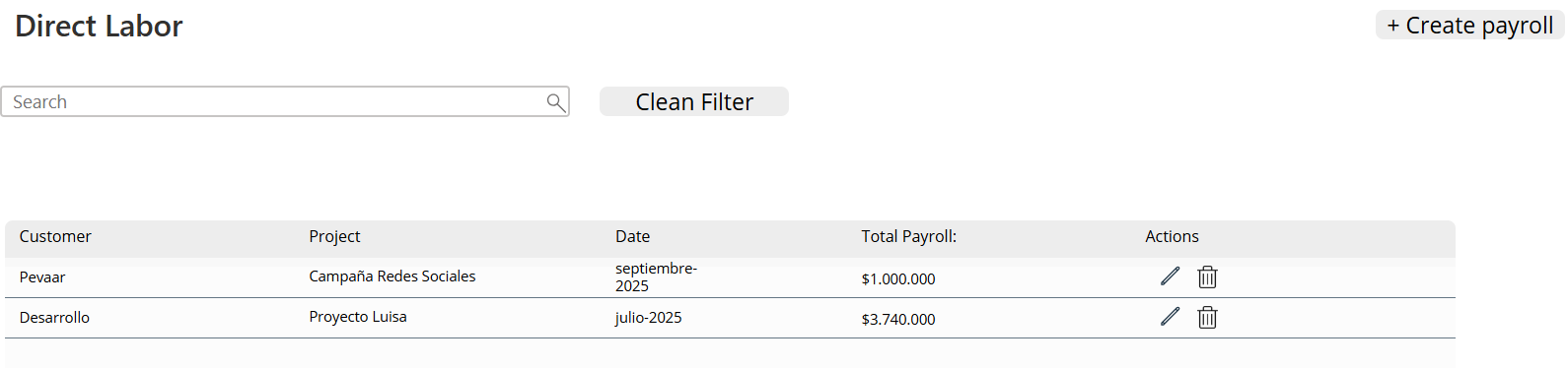
Img.33
To create the monthly payroll for the project, the process is the same as described in section 2.3. The only difference lies in the data source and the table fields.
The gallery will include the following controls:
- Item: a label that auto-increments when a new worker is added.
- ComboBox: with the Items property set to WorkerApp.
- InputText: to enter the number of days worked.
- InputText: to input the payroll value for the worker.
- Label: to display the calculated value of the worked days.
- Trash icon: to remove a worker from the payroll (same as in section 2.3).
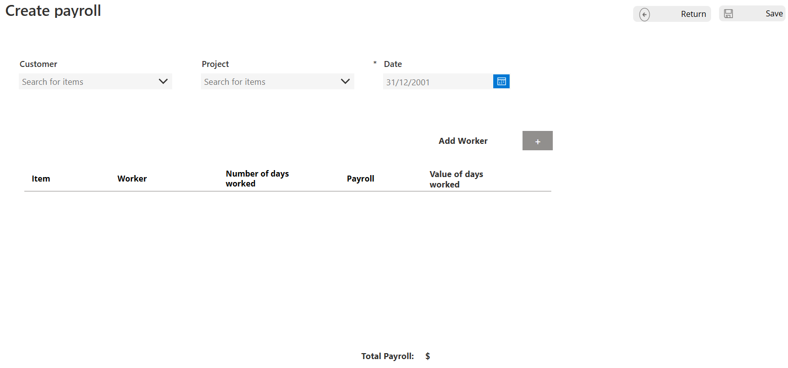
Img.34
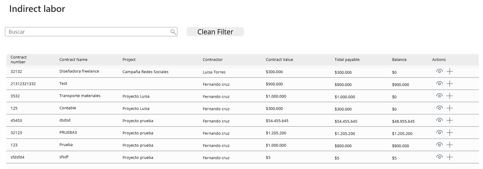
2.4.3 Indirect labor: Contracts
This is created the same way as in section 2.2.1, but using the Contract data source (Image 35).
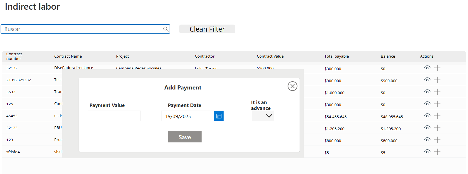
In the Actions column, two icon controls are added (Image 36):
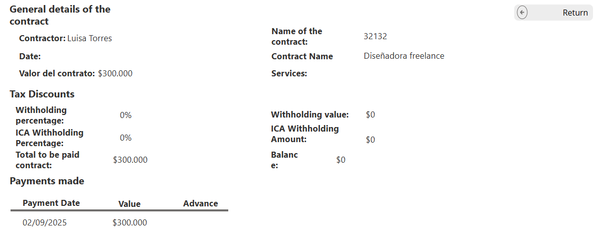
- An eye icon to view the contract details.
- A plus icon (“+”) to add payments.”
Img.35
Img.36
In the ‘+’ icon in its OnSelect property, you have
Set(SelectedContract; ThisItem);;
Set(ShowPaymentPopup; true)
Img.37
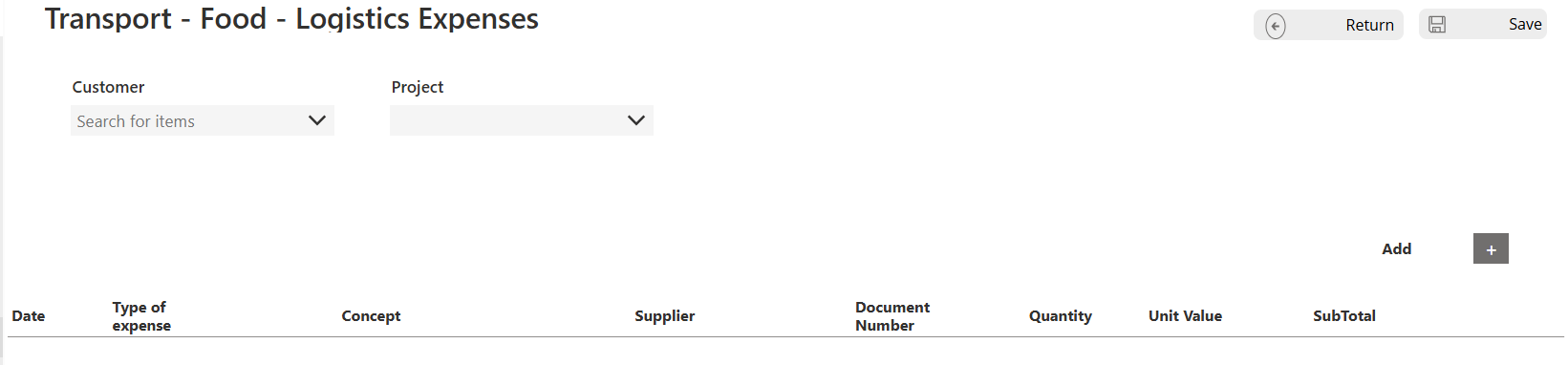
2.4.4 Other expenses
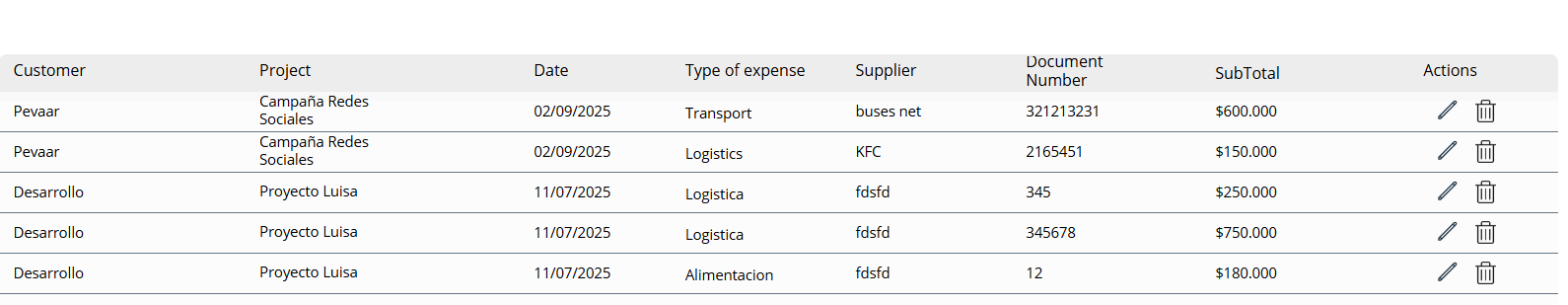
On this screen, expenses for Transportation, Food, Logistics, and others are created.The other expenses screen is done in the same way as in point 2.2.1 (Image 38)
Img.38
The screen for creating Other Expenses is similar to the Purchases screen. The difference lies in the gallery controls, where the following are added:
- DatePicker: to select the date.
- DropDown: to choose the type of expense.
- InputText: to enter the expense concept.
- ComboBox: to select the supplier.
- InputText: for the document number.
- InputText: for the quantity.
- InputText: for the unit value.
- Label: to display the subtotal.
- Trash icon: to delete the expense created.
Img.39
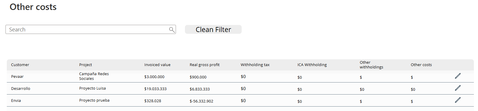
On the other costs screen, we have a table with information on the billed amount, actual profit, withholding tax, reteICA, other withholdings, and other costs. This is filtered by project.
Img.40
Module 5
Results Block
Finally, the Results module brings it all together. With clear indicators and profitability reports, it shows the big picture: which projects are generating profit and which need attention. This transforms raw data into actionable insights, closing the loop in the Power Apps project profitability app.
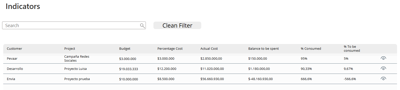
2.5.1 Indicators
The screen is created in the same way as in point 2.2.1 but the columns will be filters by project, with the following columns:
- Client
- Project
- Budget
- Budgeted cost
- Current cost
- Balance to be consumed
- Percentage consumed
- Percentage to be consumed
Img.41
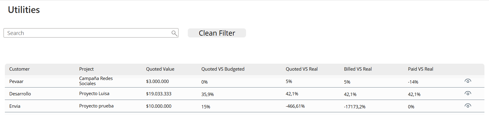
2.5.2 Utilities
The screen is created in the same way as in point 2.2.1 but the columns will be filters by project, with the following columns:
- Client
- Project
- Budget
- Budget vs Costed Budget
- Budgeted vs Actual
- Invoiced vs Actual
- Paid vs Actual
Img.42
And that’s it — that’s how simple it is to create a project profitability application in Power Apps without writing a single line of code. Are you interested in learning more about process automation? visit our blog where you will find articles on automation in different tasks.
Apps needn’t be difficult or only for developers. We’ve proven with our Power Apps project profitability app that a usable application with streamlined project management, centralized information, and real profitability is possible.
For readers, the main takeaway is clear: technology can solve real business problems without adding unnecessary complexity — a real app for a real problem. Follwing these steps helps you simplify financial tracking, accelerate decision-making, and concentrate on what really matters: expanding your projects profitably.
Ready to take your business processes to the next level? At Pevaar, we help companies turn ideas into real digital solutions. Contact us today by clicking here, and let’s build your next application together!


Leave a Reply